The Final Transformation: Whipping Up Some Kitchen Magic

What a long journey it’s been! If you’ve been following along, you know my clients—a young couple with three small children—hired me to inject some new life into their ‘70s-built, ‘90s renovated home. So far I’ve shared what we did in the family room, primary and hallway bathrooms, living/dining room and staircase—and now we come to the last area to be featured, the hub of the home: The Kitchen.
In keeping with what we did throughout the house, we made choices that resulted in a significant upgrade without tearing everything down and starting completely over. This was more cost-effective and allowed the family to stay in the home while the transformation was occurring.

Where We Started
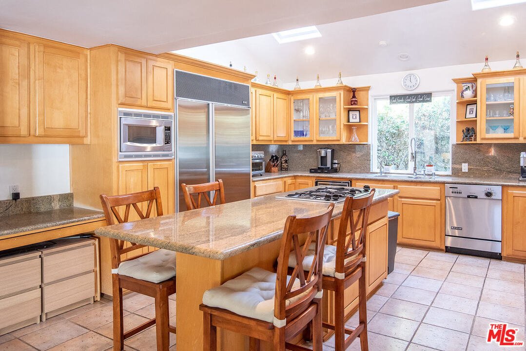
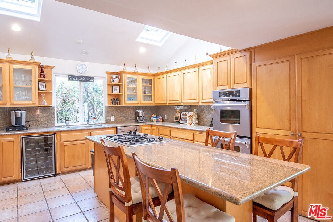
The kitchen’s layout worked well for the client. She liked the openness of everything but didn’t like the dated orange maple cabinets and felt a few of the elements weren’t as functional as she would have liked. Most of the appliances were in good condition so the client decided to leave the range, refrigerator, microwave and ovens in place.
Before


What We Did
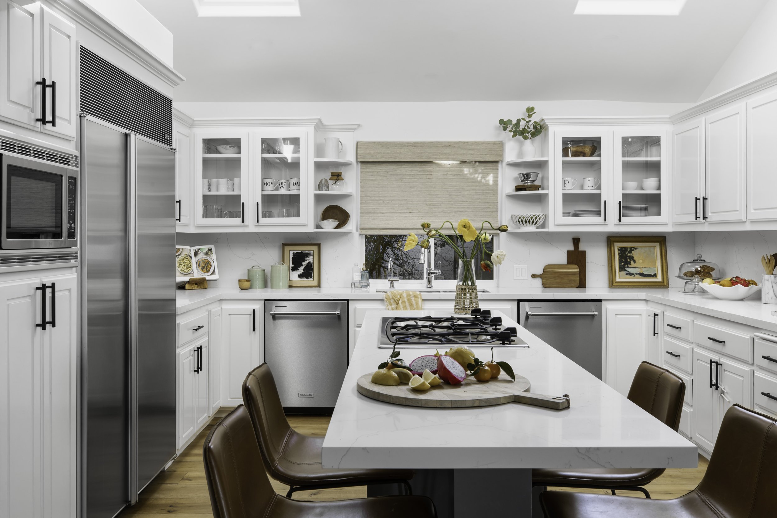
With a focus on modernizing and lightening, we replaced the granite countertops with a beautiful white quartz that has subtle charcoal veining throughout. The material is very durable but also helps elevate the look of the kitchen. The cabinets were in good condition so instead of replacing them, we painted everything white and added sleek, black hardware. A few drawers needed repair so the contractor replaced the interior hardware to make them all function beautifully.
For the island, we removed the granite countertop and replaced it with the same white quartz we used for the countertops and painted the cabinets a dark charcoal gray to help highlight the veining in the quartz. We extended the island on the interior side to accommodate new pullout trash and recycling bins. On the other side, we removed the hollow paneling and replaced it with one support leg—providing more leg room to make the seating far more functional than it had been.

We removed the porcelain sink and replaced it with a large stainless steel sink to make it more functional and add to the new modern feel. Near the sink area, there was a wine refrigerator that was on its last legs so we removed that and added another dishwasher so the kitchen now boasts two full-sized dishwashers—something that comes in very handy when cooking and cleaning up after three very active boys and their friends.
I believe every kitchen should have a beverage area, for sodas, wine or coffee (or all three if you have the space) so we decided to eliminate the small, random desk area and turn it into their bar area. It’s perfect when they entertain because it’s in the kitchen but out of the way of the person doing all the cooking. We added glass fronts to the two existing upper cabinets to display wine glasses and other glassware. We then added in a wine refrigerator and icemaker where the desk used to be.

For seating around the island, we chose slope leather counter stools because of their comfort level for kids and adults. The leather also helps bring warmth and texture into the stark kitchen aesthetic.

The End Result
The family now has a bright, modern kitchen that’s ideal for everyday use and entertaining. Most of the changes we made were aesthetic, not tinkering with the layout that already worked well. A room that was dated and a bit blah has been enhanced so it can better function as the home’s center of activity.

Without any major renovation, this formerly dated home is now a modern showpiece that will work well for this family for many years. If you’d like to discuss how to transform your home to give it an updated look, I’m all ears. Let’s talk!
If you have a project in mind or don’t know where to start, please reach out to me.
Cheers!
Julie
