Transformation: From Cold to Cool Living Room + Dining Room
About four months ago I began taking you on a journey through the dated home of a young couple with three young children that was just crying out for a transformation. I shared how we addressed the issues with the family room, the master bathroom and the hallway bathroom—without tearing the whole thing down and starting from scratch.
We’re almost done with the “walk down memory lane” of this extensive project. This month, I feature the living room and dining room—focusing on the adults’ needs rather than the kids’—as well as the entryway and a staircase that had definitely seen better days.

Where We Started
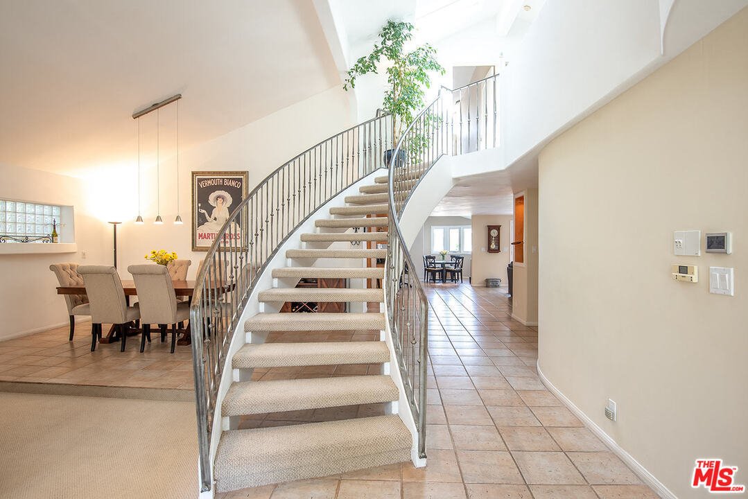
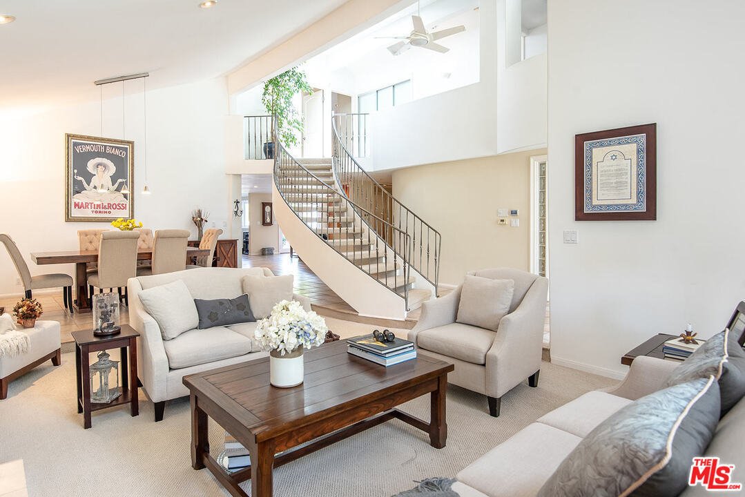
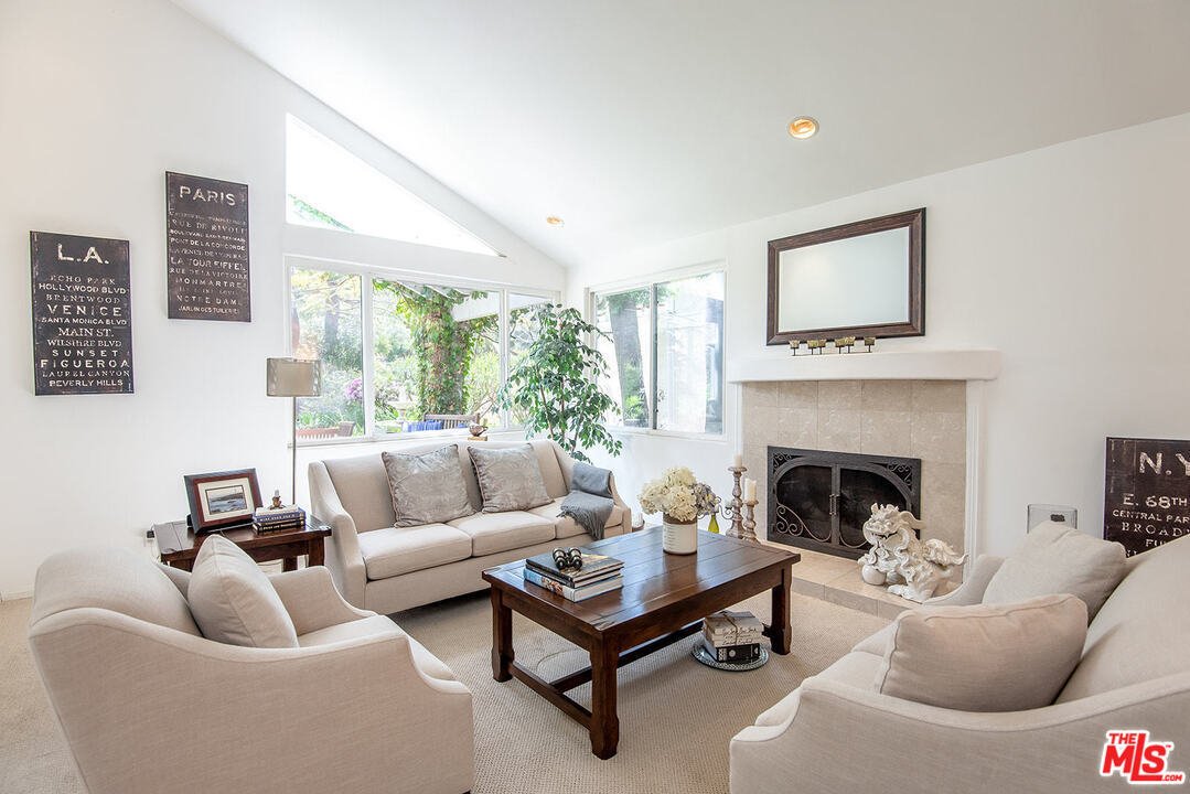
The entryway, living room, dining room and curved staircase were all part of an open floor plan—a good thing—but that’s where the positives ended. This lower level featured nondescript tiles but the staircase was carpeted. And the focal point of the living room—the fireplace—had a curved mantle that just read weird. With all the materials being dated, everything was blah and the overall feeling of the space was cold, the exact opposite of what this family wanted.
Before
What We Did
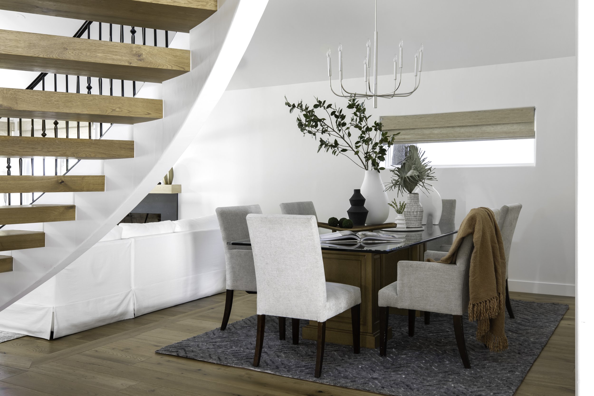
We attacked from the ground up, starting with the use of engineered oak flooring throughout the whole area—including the staircase—which immediately warmed up the space. With that one change, the staircase went from an ugly duckling to a beautiful swan and we also painted its iron railing black, which had a huge impact for very little investment.
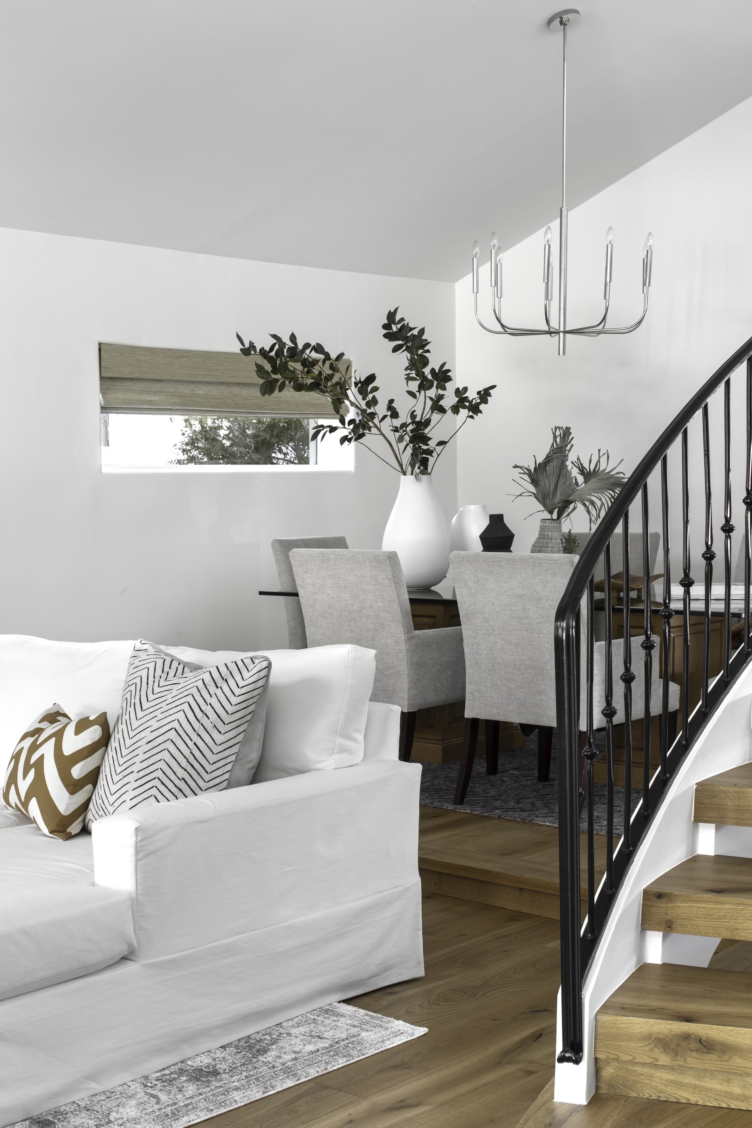
To add a bit of pizzazz to the main entrance, we hung a chandelier in the entryway—being careful to ensure it was high enough to prevent any of the kids from attempting to swing from it. We also installed a simple chrome chandelier in the dining room over the table. These new design elements did more than just look nice—they added the important element of light to the space.
To transform the fireplace, we removed the dated tile from its face and replaced it with more modern dark gray quartz. The very dated and weird rounded mantel was also removed and a custom white oak mantel was installed in its place. These two changes helped bring warmth to an otherwise stark interior.

The End Result
Boring is gone! What was dated and stale when we began is now light and bright—a wonderful space for entertaining. The client wanted to keep things simple and clean here since the rest of the house is pretty much ruled by the kids, and we accomplished that.

We’ll finish our trip through this transformed home next month with the kitchen. I do hope you’re realizing there’s no reason you have to live with dated materials or spaces that just don’t work for you. Got a design challenge for me? I’d love to help.
If you have a project in mind or don’t know where to start, please reach out to me.
Cheers!
Julie
