Primary Bath Transformation: From Blah to Aaaah
Last month, I began sharing the transformation I oversaw of a dated ‘70s-built but ‘90s renovated home for a darling young couple with three equally as darling little boys. This month, as promised, I’m sharing more of this “head-to-toe” remodel: the primary bath.
As busy parents, time for relaxation is far and few between for this couple. Their ask was for me to transform their sad and dated primary bathroom into an absolutely stunning, spa-like space that offered them a place to recharge without having to leave their home. Mission accepted!
Where We Started
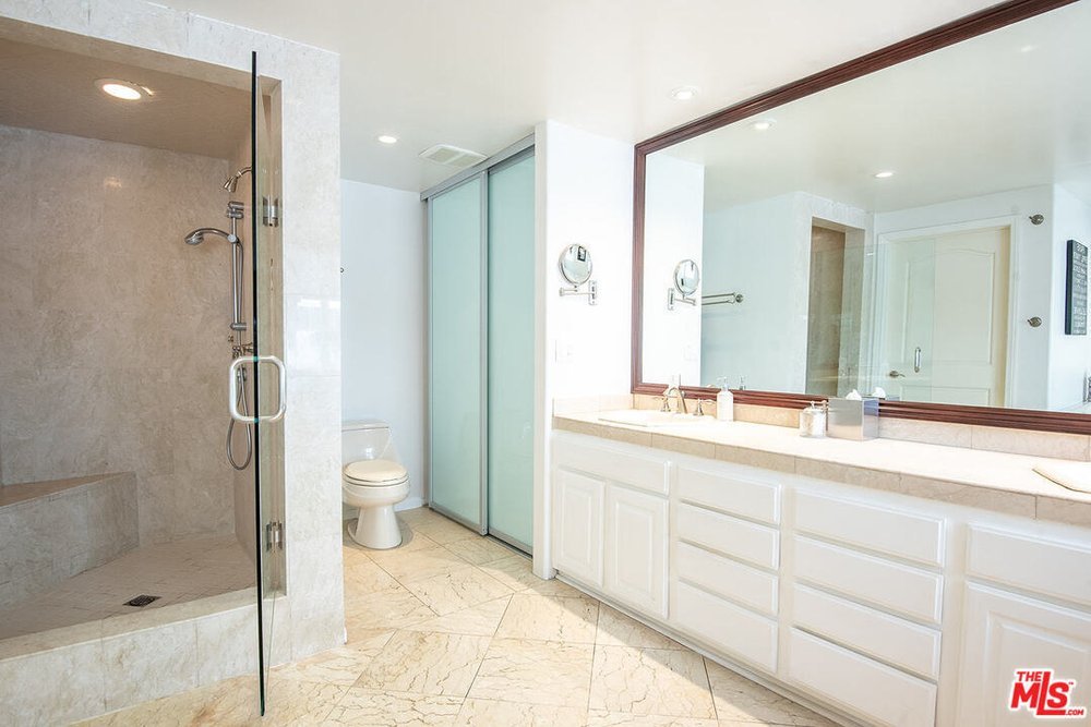
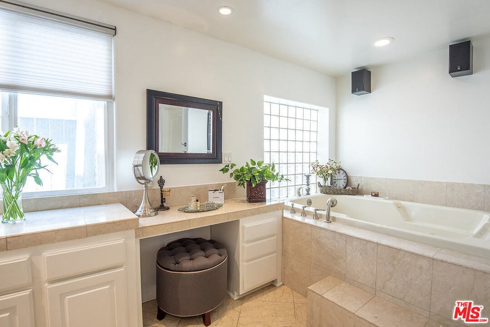
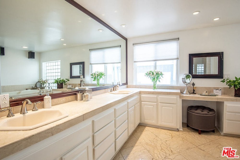
The layout of this dated bathroom was not great. The double vanity was in a fine spot but the countertops were too low and one of the sinks was pushed up against a corner, making it rather difficult to use.
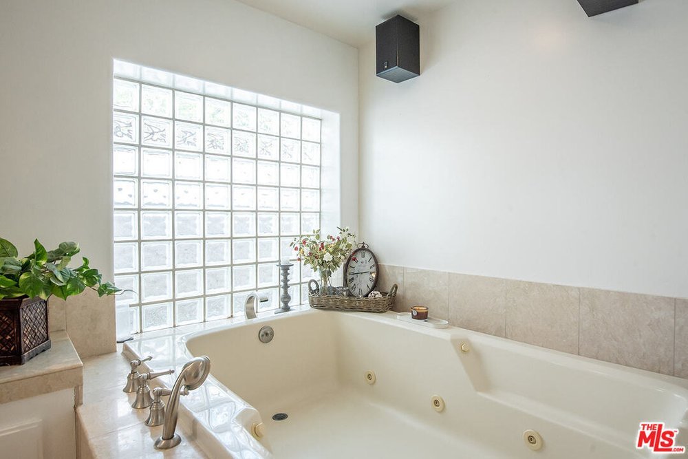
The shower felt like a cave and very suffocating. The tub area was gigantic but there was so much wasted space because of the dated sunken tub. The toilet was tucked behind the shower but there was no real toilet room/water closet so there was essentially no privacy. And the storage wasn’t sufficient; the linen cabinet was tucked next to the toilet, which made it very difficult to access.
All in all, it was a big bathroom with all the elements—but they were just in entirely the wrong spots.
Before
What We Did
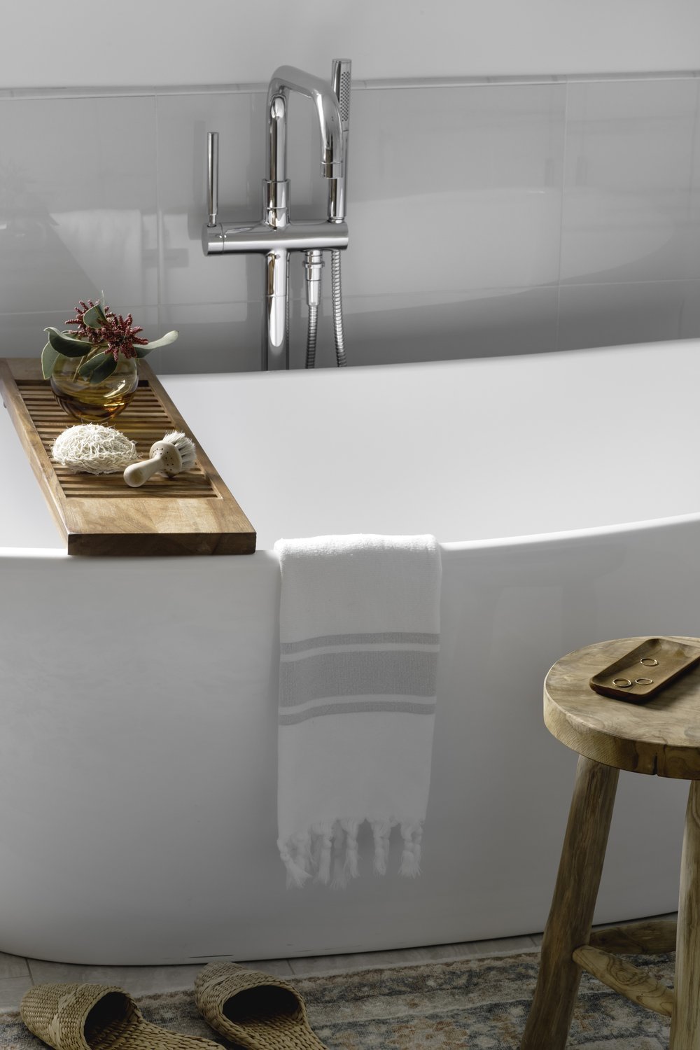
We started by closing off the original entrance to the bathroom, which allowed us to have a better layout for the new shower and toilet room. The new entrance also allowed for the beautiful, new standalone tub to be the centerpiece of the bathroom; it took the place of the dated sit-down vanity area.
Essentially everything in the existing bathroom shifted to the right as you enter. The toilet area was moved to where the shower used to be—allowing for a door (and privacy!). The large but underused area where the tub used to be is now home to the gorgeous spa-like shower, which receives tons of light through the frosted glass window on one side; that’s an original element we didn’t touch.
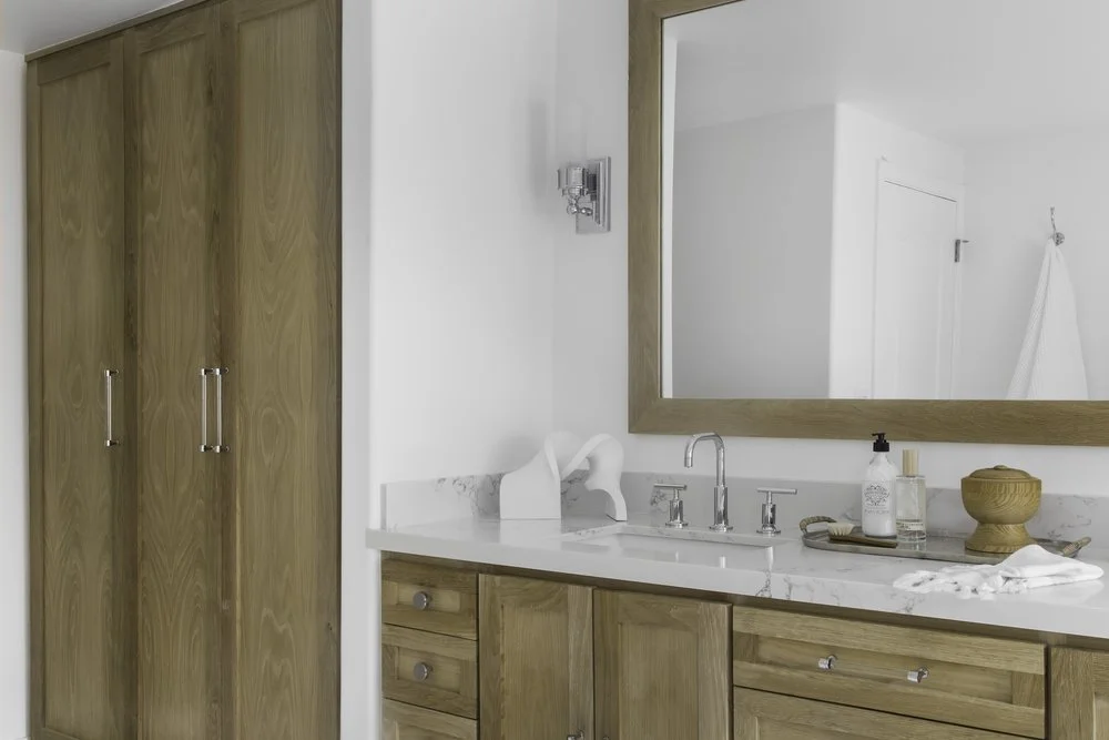
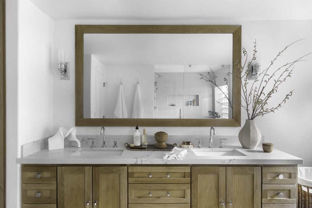
But perhaps the most impactful and beautiful upgrade to this bathroom is the custom white oak vanity and mirror we designed for the couple. With its quartz countertops and sleek, stunning fixtures, this new vanity is gorgeous and functional. We used the white oak for the doors of the linen closet as well since they are visible from the bedroom—so it was important to showcase them.
The End Result
What started out as a dated bathroom with limited functionality turned into a beautiful spa-like sanctuary for the couple to start off their busy day or retreat to after a long day. All it took was a little imagination and creativity to reimage the space to take better advantage of it. What’s the point of having a large primary bathroom if it doesn’t work for you, functionally or aesthetically? I was so happy to be able to give these young parents a tranquil space they can call their own.
Next month, I’ll share the transformation of their powder room. The end result was so rewarding!
If you are feeling a space in your home needs a little (or a lot) of love and attention but don’t know where to start, please reach out to me. I would love to help!
Cheers!
Julie


