Transformed by Design
Turning something ugly and dated into a beautiful, functional family space without tearing down the whole thing and starting from scratch.
Starting from a blank canvas is exciting for any designer. But not everyone has the luxury of building a custom home from scratch—I sure don’t. I have been fortunate to purchase homes that needed a little (or a lot) of love and attention. And while it may sound daunting or even impossible to some, I actually love the challenge of turning an “ugly duckling” into a “swan.” I find it fun and rewarding to see the transformation of really unattractive, dated rooms into beautiful spaces that have new life!
This month, I share with you in words and pictures one piece of the successful transformation I oversaw of a rather dated home, much to the delight of my young clients.
The Challenges
I jumped at the chance to assist my clients—a darling young couple with three equally as darling little boys—after they hired my firm to help them transform their dated ‘70s-built but ‘90s renovated home (not a good combo, by the way). We ended up tackling the entire house from top to bottom—and I’ll share it all with you over the next couple of months—but to start I want to unveil what we did to one of the most important rooms in the house: their family room.
The family room is an important space in any home for many reasons. It’s a gathering space for families to bond while playing games or watching movies and sporting events. It’s a place where people relax and unwind after a long day—so comfort is key. It’s also where families connect with each other and create memories, making it an essential part of their home.
The family room needs to be a flexible and functional space to accommodate various activities and adapt to the changing needs of a growing family. In this case, it also had to be child-friendly, and that didn’t just mean soft-sided furniture—things needed to be able to take a beating and last a long time. (Three boys, remember?)
Unfortunately, when we started this project, this family room did none of the above. It had cold tile floors, built-ins that were functional but really ugly, and a weird corner TV thing that was outdated and unsightly. The homeowners loved that it had a fireplace but the hearth was a weird shape and the colors were no good.
Before
The positives were that it was a great size (big enough for a large sectional sofa) and the built-ins had wonderful storage and functionality so we knew we wanted to keep them—but we needed to do something about that corner! Here’s what we did…
The Solutions
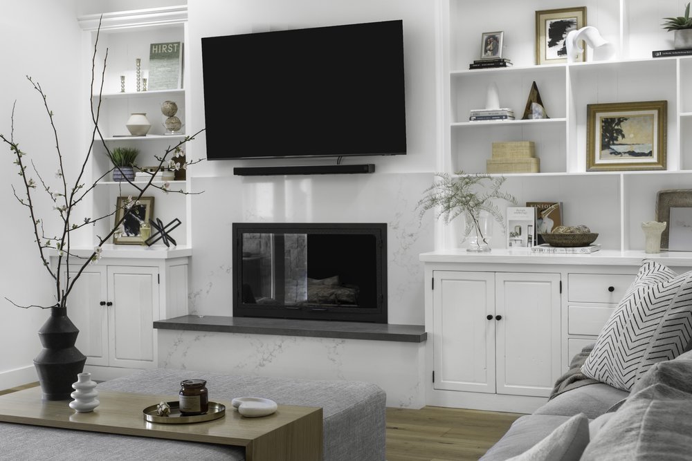
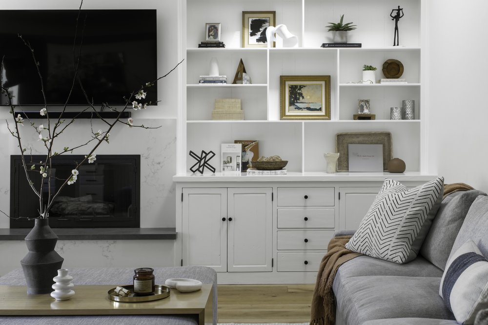
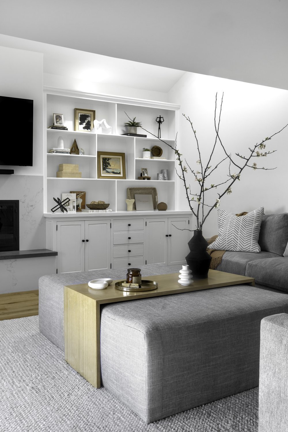
The first thing we did was demo the weird TV corner side of the built-in (bye, bye) and replace it with custom cabinetry that mirrored the other side. This made the room feel more balanced and gave us more floor space to add additional seating if we wanted to. We gave it a fresh cost of paint to get rid of the dated maple color and added simple, modern hardware. The set of awkward and ugly built-ins was transformed into a clean, functional, and beautiful area to display family photos and mementos as well as store toys, games, and electronic equipment. These simple changes made a huge difference!
Since we removed the weird corner cabinet that housed the old TV, we needed a spot for the new TV. The homeowners wanted to place it where it could be seen from the adjacent kitchen and make sure it was large enough to view games while they were entertaining friends and family. We decided to put it above the fireplace. To make that happen, we needed to remove the mantel that was there; fortunately, they have another fireplace in their living room with a mantel for hanging stockings before a special guy comes to visit every December.
The fireplace itself also needed some attention. We decided to remove the existing tile and replace it with quartz that had a very subtle gray veining to give it some interest but blend into the background so it didn’t fight with the large TV hanging on the wall. The homeowners liked the idea of built-in seating, so we used the existing hearth and created a functional bench seat, adding a charcoal gray quartz to top to pull out the gray veining from the fireplace surround and tie into the new hardware on the built-ins.
To address the cold and uncomfortable floors, we installed engineered hardwood that can take a beating but look beautiful while doing it. We then added a soft and comfy indoor/outdoor rug to give the kids a comfy place to play that’s durable and easy to clean.
To make sure there was space for all, we chose a large sectional sofa and covered it with performance fabric that’s comfortable enough to lounge on but can also stand up to three little boys (and their friends) when the family room becomes a playroom. To finish off the space, we knew we needed a sizable coffee table but we wanted it to be safe for the kids and comfortable if someone wanted to put their feet up on it. We had a custom rectangular ottoman made—covered in performance fabric—with a white oak overlay table that’s moveable, making it functional and so pretty at the same time.
The End Result
The room had such potential with its size and functionality but just needed a little love and a few cosmetic changes to give it new life. Creating a space that is functional, family-friendly, and beautiful was my goal and we were able to achieve that with just a few minor tweaks. The family loves this room and uses it constantly. That makes me so happy—giving the boys a place to play and my clients a place to relax and enjoy their beautiful family.
Next month, I’ll share the transformation of their primary bathroom. That was a bit more challenging than this room but the result was so worth it!
If you are feeling a space in your home needs a little (or a lot) of love and attention but don’t know where to start, please reach out to me. I would love to help!
Cheers!
Julie


